Case Study
June 2017
June 2017
Credits
Visual Design: teammates
UI Design: me (and teammate)
Backend: teammates
UX: me (and the team)
Visual Design: teammates
UI Design: me (and teammate)
Backend: teammates
UX: me (and the team)
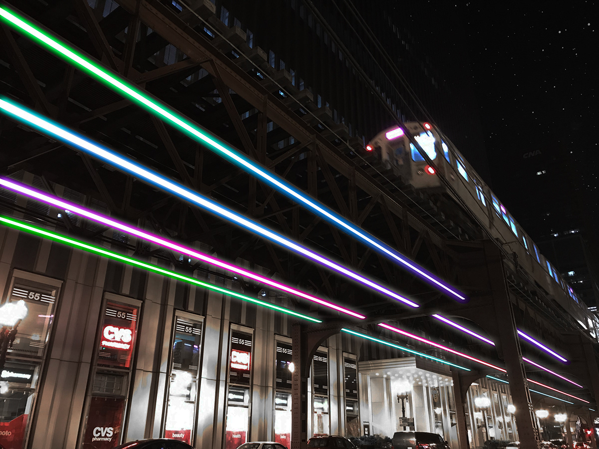
The Wabash Lights will be an internet enabled public arts platform beneath the Wabash Avenue elevated train tracks in Chicago’s loop—a dynamic, interactive experience, that will be controlled through a variety of interfaces such as mobile apps, public kiosks, and/or existing APIs (eg CTA, weather). This project involved research and design of interactive experiences for the light installation, which several teams would pitch to the stakeholders and produce a proof of concept by the end. Our team wanted to leverage the internet and social media to visualize the current mood of Chicago. We hoped to get people to engage with the public space in a creative and fun way and cultivate the sense of community.
Creative Process
What is our Strategy?
With the help of my team, I implemented a four-sprint plan, with each sprint lasting two weeks. Each member of the team was assigned specific disciplines according to their strengths: Design, UX, and development. After I had done some initial discovery on information visualization as well as current and past interactive public art installations, we settled on the Sentiment Board concept, which would basically be an API using a combination of Tweets displaying the “mood of Chicago” in real-time. We had periodic check-ins with the stakeholders to keep them updated on our progress as well as internal stand-ups on a weekly basis.
Empathize

The UX team and myself conducted user interviews investigating what people thought about the Sentiment Board concept and how they would want to interact with it was our first task. We found that people gave the idea a thumbs up and showed interest in wanting to interact with it while at the Wabash Lights. Through a couple rounds of interviews, we were able to better understand our audience:
1) A kiosk would be an easier way to interact with the Sentiment Board on Wabash St.
2) We figured out what sentiments people actually related with different colors
2) We figured out what sentiments people actually related with different colors
Define

When we discovered the need for a kiosk so that people could interact with the lights based on their mood, we got to work on the prototype. With the limited time we had to come up with a solution and a vague idea of how the user flow looked like, we decided to go low fidelity with paper prototyping. With a little imagination and just the right amount of explanation, we were able to rapidly iterate and make changes with pen and paper than we ever could using software.
Design
Twitter scraping demo
Since our goal was to get people engaged and cultivate a sense of community, the dev team leveraged the idea of scraping data from Twitter to get the moods of everyone in the city. The solution they built on Python was called "V.A.D.E.R."
Our findings from our earlier user interviews helped narrow down the colors to use for each sentiment, like blue for sad. However, one obstacle we came across was how big an area of the city we would include in our "bounding box" when tweets were being scraped. The larger the area, the longer it took to process. So we decided to limit the size of the box to just the Loop in Chicago surrounding the Wabash Lights installation. Not only did this simple solution quickly process the data and visualize it on our virtual Sentiment Board, we also avoided any inadvertent division or tension between the different areas of the city. The idea after-all was to bring people together through the lights.
Test
Kiosk interactive prototype
How do we validate our design decisions?
We had defined what our kiosk interaction would look like through iterative usability testing. We designed a program that would visualize the mood of the loop. But we did not have the ability to interact with the kiosk prototype yet. So what did we do instead? Wizard-of-Oz testing. This enabled us to test unimplemented tech by using a human to simulate the interaction when our participants tapped on an emoji. In our case, I would manually create the sentiment visualization using pre-recorded demos. The response from our participants was surprisingly helpful.
Key Takeaways
Our group came into the project during the second half, when other teams had already finished fleshing out their research and concepts. We accomplished our primary goal in the end, but at the expense of not having enough time to get our prototype to the fidelity we wanted. Ultimately, we became too ambitious by trying to explore two concepts, the second being a CTA-themed visualization. In the end, the stakeholders were not quite sold on the idea but would have loved to see an online demo that communicated with the light installation if we were given more time to work with.